Documentation – version 3
Get the data in the online Spreadsheet, or » Download Excel file
What is gini?
Gini measures inequality: How large are the income differences within a society. First imagine you line up all people in a country, ordered by income: The poorest to the left and the richest to the right. Now you walk from the left to the right asking how much money they earn every year, and you add up the number. When you reach the middle, you have counted 50% of the people, but the richest half remains. The amount of income you have added up is much less than 50% of all the money, say , maybe 20%. Maybe 10%? If there are lots of people with low incomes, you will have added maybe 15% of the money for the poorest half of the population, but if the income differences are less extreme, the 50% poorest may earn 30% of the incomes. If everybody earns the same, you would have gotten to 50% of the money, after asking 50% of the people. In that case (which never happens), the gini is zero. No inequality. The opposite extreme case (which also never happens) would be that only the richest person has any income: one guy earns all the money. Then the gini is 1. Perfect inequality. But most countries have a gini somewhere around 0.4, in-between these two extreme examples.
Summary documentation of v3
For our long series, we have aligned everything to PovcalNet data in 2013, which has the most comparable and broad coverage of gini data for almost all countries, during the last 2 decades. For each country the trends in PovcalNet starts in different years, and we have linked them back to 1800 based on whatever is available for that country from the three sources LIS, Chartbook Of Economic Inequality, CLIO Infra and van Zanden et. al. 2014, listed below. When data was missing, we used the closest year with data and just extended the time-series back to 1800.
We strongly recommend against using our ginis for numeric analysis. Gapminder uses them only to create global Income Mountain, to confront the false worldview of a divided world. For this purpose, the the uncertainty of specific countries has minor effect on the big picture. In most cases, a huge differenc of gini between 30 or 40 will not change a pixel in the global picture on your screen.
For years beoynd 2015 we have copied the latest available gini (often a number for 2013 from PovcalNet), as we have no way of predicting how income distributios in countries will evolve in the future. We use these numebrs only to draw the “if-scenario” describe at the bottom of this page here: gapm.io/incm
Sources used
Using our Ginis for changes of countries inequalities is not recommended in general. the data might be good enough for that in a few countries and a few decades, where solid data exists from a consistent source. But for those numbers you better access them directly form that source instead, listed here in the order we prefer them:
Most reliable contemporary gini sources:
— LIS: Luxembourg Income Study Database provide Gini’s for disposable household income (DHI) for 47 countries, where some of them reach back to 1970’s.
— PovcalNet, by the World Bank has Ginis for average monthly per capita income, based on 1500 household surveys spanning 1979-2015 and 163 countries. Data was downloaded on December 1, 2018. Almost all countries have data for several years between 2000 and 2013. Half the countries have data back to 1985. This is what we use as benchmark for our longer time-series.
— Chartbook: The Chartbook of Economic Inequality has gathered trends for different kinds of Ginis and other inequality measures but they are not standardized. Those trends guide our guesstimations in a few cases.
Estimates of historic inequalities
— CLIO Infra: These are based on records like difference of body-height of soldiers.
— van Zanden et. al. (2014) : In our data we also have included a few estimates we got sent to us, directly from Bas van Leuven , which were part of his calculations published by OECD here: Income inequality since 1820. In Jan Luiten van Zanden, Joerg Baten, Marco Mira d’Ercole, Auke Rijpma, Conal Smith & Marcel Timmer (Eds.), How Was Life? Global Well-being since 1820 (pp. 199–215). OECD Publishing.
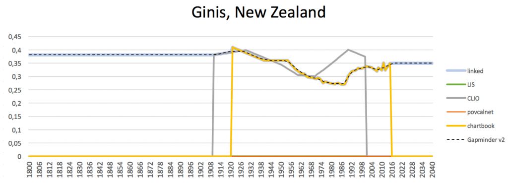
PovcalNet is missing ginis for a few countries
But Like in the case of New Zealand, PovcalNet has no data, and instead we use the Gini from the Chartbook, for “Equivalised disposable household income”, based on Perry (2016, Table D.8) , from the Ministry of social development of New Zealand. This is just one of the examples, where we are combining Ginis that are not exactly measuring the same income, and we haven’t got the resources to evaluate the methodologies and determine how it compares to the Ginis of PovcalNet. The shows how the combined series look for one example: New Zealand.
For transparency we provide the files with the formulas used to calculate this data here, but we haven’t had time to clean them up and the documentation is not sufficient to follow all steps in the process, see our data method overview. Any questions about the data and suggestions for how to improve it are always very welcome: in our data forum.
Previous versions